I've written before about the symbolism of my painting "Terra Australis Magnus" and its roots in my design of a new Australian flag. This post is about the various players involved in that quest.
There has long been a movement among Australians to remove the Union Jack from the Australian flag. It's widely seen as an anachronism for a country that is independent of Britain.

Having another country's flag in the canton of one's own is unacceptable to many Australians
Have a quick look at the current Australian flag. It has the Union Jack in its "canton", or top-left corner. Directly under the Union Jack is the seven-pointed Commonwealth Star. Six of those points represent the six states of the country. The seventh represents not just the two territories but also all future states and territories. On the right is the Southern Cross (Crucis Australis), a constellation prominently visible in the Southern hemisphere.
I became aware of the movement to replace the Union Jack in the Australian flag sometime after I migrated to Australia, and I immediately and wholeheartedly agreed with it. After all, I had just migrated from another former British colony, and India had lost no time in changing its flag after attaining independence. In fact, all the former colonies of Britain now had their own flags, with the two most prominent exceptions being Australia and New Zealand.
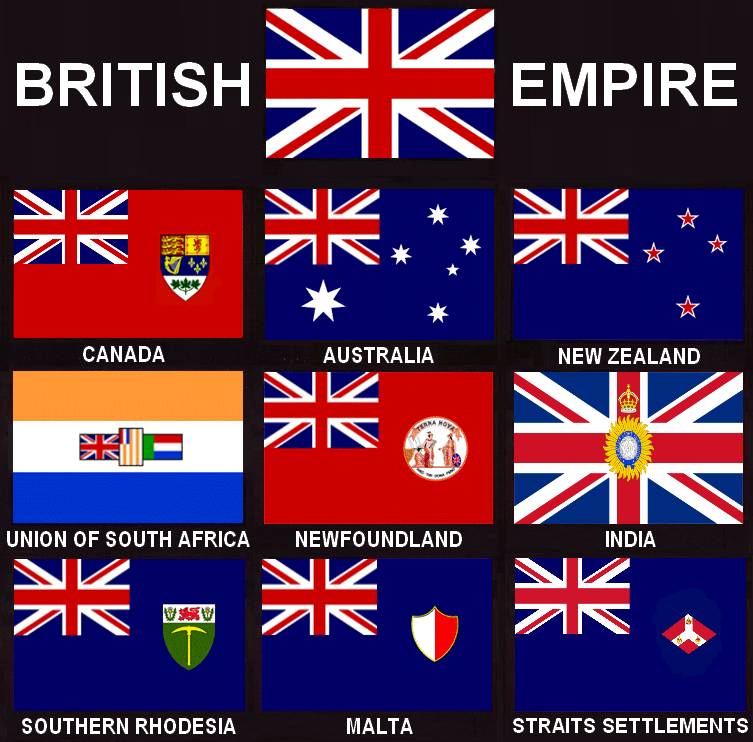
At least India got special treatment as the "jewel in the crown" of the Empire, but there's nothing like having one's own flag
I joined the Facebook group "Change the Aussie Flag", and have seen many alternative designs here, and also contributed some of my own.
The Eureka Flag
There has long been a contender for the position of Australia's national flag. It's called the Eureka Flag, and it looks like this.

The Eureka Flag has had a chequered history
The flag had its roots as part of a miners' revolt, and has been associated with protests ever since. (Supporters of former prime minister Gough Whitlam wore it to protest his dismissal by the Governor-General.)
The Eureka Flag doesn't enjoy wide popularity, but there are some who are fanatically loyal to it. Regardless of its emotive appeal (positive or negative), I find that its aesthetics leave me cold. Blue-and-white is a weak colour combination (sorry, Greece and Israel), and there isn't any contrast between the white stars and their white background, just a thin blue line as a separator.
The Eureka Flag doesn't enjoy wide popularity, but there are some who are fanatically loyal to it. Regardless of its emotive appeal (positive or negative), I find that its aesthetics leave me cold. Blue-and-white is a weak colour combination (sorry, Greece and Israel), and there isn't any contrast between the white stars and their white background, just a thin blue line as a separator.
Southern Horizon
One of the first alternative designs I came across was the one called "Southern Horizon", designed by Brett Moxey.

Southern Horizon won an opinion poll of about 8000 respondents in early 2016, but this was not an official contest for a new national flag, and I believe the race has only lately begun to hot up
What the Southern Horizon design has done is propose a minimalistic set of changes to the current flag, so as not to upset those who are attached to it. It removes the Union Jack from the canton, then moves the Commonwealth Star upwards to take its place. To address the large empty space left behind at the bottom, it introduces the official Australian colours of "green and gold", following vexillological principles of interposing a metal (gold) between two colours (blue and green). By making the green and gold stripes wavy rather than straight, the design also solves the problem of filling different amounts of empty space beneath the Commonwealth Star and the Southern Cross.
Southern Horizon takes the safe route of proposing a compromise design that balances the conflicting requirements of continuity and change.
Southern Horizon takes the safe route of proposing a compromise design that balances the conflicting requirements of continuity and change.
Golden Wattle
When I first saw Southern Horizon and understood its design imperatives, I felt that a compromise design would only last as long as no alternative, good design emerged, and I believe I was proved right. Of late, a new flag design called the Golden Wattle has gained in popularity, and many former supporters of Southern Horizon have switched loyalties.

The Golden Wattle - Simplicity and elegance pack a powerful punch
The golden wattle is Australia's national flower, and its colours of "green and gold" are Australia's national colours. What could be more natural than to put these colours in the shape of the flower on the national flag? And when the negative space enclosed by the petals also forms the Commonwealth Star, that can only be described as a stroke of genius. The Golden Wattle looks like a winner, and if another opinion poll were to be conducted today, I have no doubt that it would beat the compromise design of the Southern Horizon.
Remember the right-pointing arrow cleverly hidden in the negative space carved out by the letters of the FedEx logo? The Golden Wattle pulls off a similar neat trick
The Fixation with Green and Gold
Golden Wattle managed to pull it off, but many other designs that were fixated on the idea of using "green and gold" were not imaginative enough to produce anything appealing.

This design was virtually predictable given the constraints of retaining the Commonwealth Star and the Southern Cross, and using a green-and-gold colour scheme

Kyron Bracey's design loosens the constraint against using a third colour
Somehow, none of the green-and-gold designs ever appealed to me, except for Golden Wattle. (As we will see later, Golden Wattle "cheated", so to speak, on using the official colours, in the interests of a more appealing look.) Sad to say, the official hex codes (#FFCD00 and #00843D) are not a great colour combination, and the designer who believes they must use these two colours has dealt themselves a bad hand right from the get-go.
The Cool Ones
Many of the designs I saw on the "Change the Aussie Flag" group site were only passable, although some were quite striking.

I'm not sure whose design this was, but I thought it was interesting

Brendan Jones and his Reconciliation Flag

Brendan Lloyd revisits the mandatory green-and-gold with a boomerang theme

I'm not sure who designed this, but Daphne Visbal reported that it was seen on Reddit
The quest for simplicity and elegance
While many of the designs proposed were interesting, they were also a bit complex. I hadn't seen too many designs that were as simple and elegant as Golden Wattle. But there were a few.
For example, these designs by Brian Nedic were immediately appealing to me.


Brian Nedic's stars were unlike anything I had seen until then
The "Change the Aussie Flag" membership is a tough crowd, and Nedic got his share of negative comments, suggesting that his designs looked more like the logo of a white goods company like Electrolux than a national flag.
Nevertheless, these stars made a powerful impression on me. I was star-struck, you could say.

After seeing this new, concave style of star (formed out of the negative space of four circular quadrants), I could not go back and use the traditional five- or seven-pointed star in my designs ever again. They just looked so dated.
The new style also seemed to shine like real stars.

The new style also seemed to shine like real stars.

Note the "plus" shape of bright lights in real life
Then I saw another set of designs that appealed to me, and I had no idea what dangers lurked there.

Joseph O'Donoghue's design

Mic Rogan's design
I don't remember which of these came first. Perhaps O'Donoghue refined Rogan's hand drawing. At any rate, the use of an Aboriginal motif seemed to be a no-brainer for an Australian flag. How could we ignore the First Peoples when designing a new Australian flag? It seemed the best way to honour them and their legacy to Australia.
Timeless Red Earth
With these two inputs, I created a design that I called Timeless Red Earth. I had been struck by the cover of the Lonely Planet guide to Australia that I bought in India before migrating here in 1998, and I had to use this shade of red.

Until I saw this cover, I had always associated Australia with the Sydney Opera House and Harbour Bridge, never with red sand dunes

A traditional Aboriginal-themed sun and a stylised, futuristic Southern Cross, antisymmetrically balanced against a background of red earth - what could go wrong?
Unfortunately, a lot could go wrong, as it turned out. My well-intentioned attempt to honour the First Peoples of Australia was attacked by some as a form of "cultural appropriation". While I reject that very concept as an example of ultra-leftist manufactured outrage, this is not a hill I choose to die on, so I decided to move on and use a less controversial motif instead. (One can learn from this example how a marginalised community ends up being even more marginalised because their self-styled defenders on the extreme left ensure that no one else is allowed to champion their cause in anything but an "approved" way.)
Someone suggested the Golden Wattle as an alternative motif, and I looked into the flower itself for inspiration.

The Golden Wattle is not a conventional flower but a compound one called an "inflorescence", made up of many smaller flowers called "florets"
I had to design something that looked like an inflorescence, without making it as complex as the real thing.
Great Southern Land / Terra Australis Magnus
After repeatedly submitting modified designs in response to feedback, I finally arrived at a design that combined a seven-sided Golden Wattle (very different from the one used on the Golden Wattle flag) and a stylised Southern Cross inspired by Brian Nedic. I had a choice of colours, and rather than pick one set, I submitted a number of them to the group for feedback.

These are some of the possible variants of Terra Australis Magnus (Great Southern Land). Click to expand
The Schoolkid Test
One of the criticisms that are sometimes levelled at sophisticated flag designs is that they are hard for children to draw. The right thing for me to do would have been to get a schoolkid to try drawing this design. But since there were no school-going kids within call (my son is now in University), I had to be the schoolkid. I took out my stopwatch and measured how long it would take to outline and then to colour one of the variants to Terra Australis Magnus. I chose the one with a red-and-blue background for this experiment.

A little over a minute to draw the flag in outline

A little under two minutes to colour it in
Giving myself a factor-of-three handicap, I suppose a real kid could do it in about 10 minutes.
A Note on Competition
While there may or may not be a monetary prize associated with winning the design contest for a new Australian flag, the prestige is enormous, and I have approached this challenge with relish. I have some strengths, I believe. I am both right-brained and left-brained. I can see what has visual appeal, and I can hack an SVG file, using coordinate geometry to shape, size and colour its elements.
With all respect, I don't believe Southern Horizon is competition anymore. The new front-runner is Golden Wattle. I looked to see who had designed it, and came up with the name Jeremy Matthews.
I also searched the Change the Aussie Flag site for all the elegant designs I could find. I found a very cool one involving a leaping kangaroo. Normally, flag designs involving roos are godawful, as this sample set shows.

Some seem like ripoffs of the Qantas logo, while others are just plain awful
This particular one stood out for its elegance.

A design put together by Ian McLennan, but he said he was just modifying someone else's design
After some more searching, I found the original.

Ian had contributed something important by moving the roo off-centre, but the original design was cooler in its choice of colours. Who created it?
I found that the creator of the Roo design was none other than Jeremy Matthews, the creator of Golden Wattle. The man clearly had flair.
I had seen a few more flag designs that had struck me as being extremely elegant, and I looked at them again.

The current and proposed flags of New South Wales

The current and proposed flags of Western Australia

The current and proposed flags of Queensland
All these proposed flags used the state colours, and featured the flora or fauna of the state. And on top of it all, they were elegant and sophisticated. Who designed these flags?
One name turned up. Jeremy Matthews. Yup, the Jeremy Matthews.
I was heavily intrigued, and did a Google search on Jeremy Matthews.
I confess my heart sank when I read his biography. The guy was a graphic designer.
No wonder his designs were streets ahead of everyone else's! This is what he did for a living. What hope did we amateurs have against him in this flag contest?
Yet, I took heart from a line in "Marketing Warfare" by Al Ries and Jack Trout, "When going up against the market leader, don't attack a weakness that is a weakness; attack the weakness inherent in their strength."
What are the strengths of a professional graphic designer, whose inherent weaknesses can then be exploited?
I could see a few straightaway.
One, a graphic designer lives in the world of corporate brands. They understand brands, and they understand how to communicate a brand's value proposition with one simple logo image. The flip side of the coin is that they are trained to see the presence of more than one image as potentially confusing to a prospect. It's mental clutter. And that was indeed what Matthews had done with Golden Wattle. He used just one symbol to communicate a number of values. However, a national flag may need to communicate many more. One symbol, however clever, simply cannot carry them all.
Two, a professional graphic designer is careful to protect their intellectual property. Sure enough, Matthews had copyrighted his design, all rights reserved. No commercial exploitation of his work was permitted. IP protection is a two-edged sword. The creator maintains control of their IP, but then no one else has any incentive to popularise it. IP restrictions on Golden Wattle had the potential to dampen its viral spread.
Three, the cleverness of the Golden Wattle design in incorporating the Commonwealth Star results in a botanical inaccuracy. The actual golden wattle's "flower" is technically a compound structure called an inflorescence, but the Golden Wattle flag design makes it appear more like a conventional star-shaped flower belonging to the asteraceae family, such as a daisy. There's an opportunity here for an alternative design that is equally elegant but looks more authentic.

The Golden Wattle flag resembles a daisy rather than a real golden wattle!

I can sympathise with Jeremy Matthews for the dilemma he must have faced, and I can understand his eventual choice
Golden Wattle is hence not fully authentic in terms of colour, and another design that uses the right colours in a better combination might therefore stand a competitive chance.
I believe the Terra Australis Magnus design is probably competitive for these reasons.
First, it uses more than one symbol that is of importance to Australians - the Golden Wattle and the Southern Cross. There is also a choice of meaningful background colours, such as those of red earth and blue gum.


Golden Wattle, Southern Cross, Red Earth, Blue Gum - This flag carries a lot more imagery than a single icon can. After all, a national flag is not a corporate logo where one has to stay "on message" with one value proposition, so a background of graphic design may not necessarily be an advantage
Second, I come from the world of Open Source software, having been a Linux user since 1996. It was the most natural thing for me to seek to evolve my design through community feedback (the bazaar model) rather than lock myself in my studio like a solitary creative genius (the cathedral model). Similarly, I had no desire to keep my design proprietary. What evolves through community input belongs to the community, and so I made my SVG source files available under a Creative Commons Attribution-Share-Alike licence. There is no restriction even on commercial activity. If someone wants to sell T-shirts with my flag design on it, more power to them. I'm hoping the sense of community ownership will fuel the design's continuous improvement and garner more support as time goes on. This is, after all, a community-contributed design, and more than one person can point to some element of it or another and say, "I contributed that!"
Third, the representation of the golden wattle is truer to nature (the "inflorescence") (although it has been likened by some to a mediaeval torture instrument, a football, a magic mushroom, and car valves).

The compound structure using florets is more representative of reality, without being too complex
Fourth and finally, in the variants where a green-and-gold theme is used, I took care to stick to the official colours. With the offsetting effect of other colours, these shades don't look quite as bad as they do on their own. To the dyed-in-the-wool green-and-gold loyalists, this should put Terra Australis Magnus above Golden Wattle.


The navy blue area offsets the less-than-appealing look of the official colours
The Kangaroo Revisited
Although in general I'm not a fan of animals on flags, it's undeniable that the presence of a kangaroo will cause a flag to be instantly recognisable around the world as the Australian flag. It's just that most designs involving roos have been terrible.
But then Ian McLellan began to produce a few interesting ones that didn't look bad at all.


This last design inspired me to create the following tricolour:
Although in general I'm not a fan of animals on flags, it's undeniable that the presence of a kangaroo will cause a flag to be instantly recognisable around the world as the Australian flag. It's just that most designs involving roos have been terrible.
But then Ian McLellan began to produce a few interesting ones that didn't look bad at all.

Not many like the coat-of-arms style, because it still seems a bit redolent of a monarchy, but this didn't look too bad

This was beginning to look like a possible flag...
This last design inspired me to create the following tricolour:

Something for everyone
I had read a few days earlier on the site that vertical tricolours symbolised a revolt against a European monarchy. That's appropriate in the Australian context, since the quest to remove the Union Jack from the flag is a revolt of sorts against the British monarchy.
The roo-on-ochre theme makes the flag instantly recognisable as the flag of Australia.
The golden wattle, rendered in green-and-gold, should satisfy those who believe the Australian flag must carry the "national colours". I'm a bit meh on this, but whatever.
I personally like the heraldic colours of red, white and blue, and I'm fond of the Southern Cross (especially in Brian Nedic's futuristic style), so that makes up the third stripe.
Update 27/09/2020:
Here are some more designs that I've created later. These involve a simpler golden wattle and stars that look sharper (thanks to cubic rather than quadratic curves).


